What is a Histogram?
... a mighty slick tool that can transform your photography
Have you ever used your camera's histogram?
If you're a photographer, it's a VIC (Very Important Concept).
... a nifty extension to your camera's photo review screen. If you use it, you'll be able to nail the exact exposure you need for the particular image you have in mind,
|
So, get out your manual and turn on the histogram. Watch my video and get this tool working for you. |
 |
Download a PDF script of the video - Exposure - Part 1
Why You Must Use Your Camera's Histogram
Why don't we just shoot pictures and look at the preview on the back of the camera?
After all, what's the photo preview for except to see if it's a keeper or a throw-away?
Here's why we need more than just a quick peek at our camera's LCD.
- Not all camera LCDs are created equal. Usually, what you pay for is the quality you get... some LCD's are much better than others.
- Like your computer monitor, the image looks different in different lighting situations. It's almost impossible to see an image in bright sunlight. If you can, you have much better vision than I do. What about if you're in a dark club or out in a field at night? All light has different qualities and the JPG image on the screen looks different in each.
- You may have set the light on your LCD brighter or darker than average and even average varies from camera to camera.
The Histogram
...An easier concept than you might think!
|
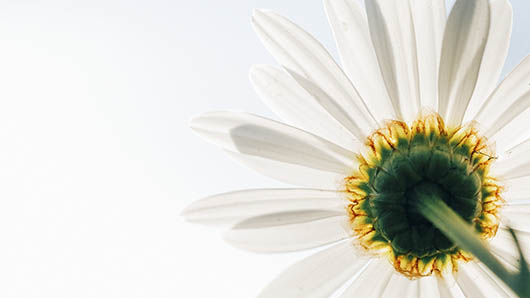
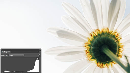
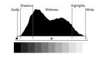
A tonal map of an image. There's an abundance of mid-tones with very few dark tones, some shadows and highlights. But no "clipping" in the dark or highlight tones... i.e. no pure black or white. | |
|
There are 256 shades of brightness in a photography histogram. The tones run from dark (black) on the extreme left to the highlights (white) on the extreme right. | |
|
The tonal graph is not all black, it's actually a gradual flow of 256 tones across (x-axis), from dark on the left to highlights on the right. The height of the curve (y-axis) reflects the # of pixels in each tone. | |
|
If the tones in your image bunch up at the arrows, you've underexposed (lost detail in the darks) or overexposed (lost detail in the highlights) . Often, but not always a bad thing. |


I've only touched the surface in this article and you want to learn much more about histograms. If you do, google camera histograms and you'll find all the information you can handle!
Is My Exposure Correct?
Let's look at a few images with their matching tonal graphs. With a little practice you'll learn how to read yours and make the adjustments you need. To adjust your exposure you also need to learn about shutter speed, aperture and ISO.
Get up to snuff with my Video Introduction to Exposure Series, which leads into a course on how to further improve your photography. The first step... Exposure... is a free video series so take advantage of it. And if you like those videos, how about joining the program?
You'll get the details in the Exposure Video Series. Part 1 is up there... at the top of the page.
How about we start with correct exposure, then look at the same image with not enough light.. underexposure, then too much light... overexposure.
|
These are orchids in the Foster Botanical Garden in Honolulu. This is exactly the way I saw them.... a dark yellow and maroon. Since the orchids were in a greenhouse and sheltered, the light is even with no shadows or direct sunlight. |

|
The histogram has tones in all areas and there's good contrast in the photo. The majority of pixels are in the mid-tone range and there are some dark, more shadows and not a huge number of highlights. If you evaluate the photo, the histogram information matches the picture. |

This photo is underexposed. There's not enough light hitting the sensor. Just looking at the histogram would tell me that.
I'd know because I could see the scene and translate it into a general tonal curve in my mind. The dark tones are blocked up at the left side and there's a spike along the edge.
I know this image needs fewer dark and shadow areas and more mid-tones and highlights, so I'm going to change my exposure to give it more light.
I can do it in small stages if I'm not sure about how much more light's needed. It's not like film, delete is easy and cheap!


Oops, too much light. The highlights are all blocked up on the right side. I know that there are so many more tones in the scene I'm looking at! This is overexposure and now it needs less light.
How do you choose exactly how to change your exposure? Watch these videos.
This is kinda' fun. Let's look at a few more images.
|
A yummy photo (thank you picjumbo.com for this image). Low contrast images with no dark tones and reduced shadows are a popular trend. They're very subtle and in landscapes, quite relaxing. | |
|
You'll see this a lot in fashion... a flattering look for skin tones. Some photographers don't like the look at all. I do, in some cases. It's your photo and your choice. Please yourself! |


In the luminance histogram, the darks and shadows are gone... there might be a microscopic number of pixels in the shadow area. This is almost exclusively an image of mid-tones and highlights.
A photo with lots of white space and a subtle subject.
|
Before you look at the histogram, what do you think it looks like? Where are most of the tones going to appear... dark, shadow, mid-tones or highlights? |
 |
|
Probably not a big shock... LOTS of highlights. There are some mid-tones, as well as a bump of dark/ shadow tones. The dark tones are all just above the stem. The picture was planned. |
 |
A night scene is obviously going to have a lot of dark and shadow tones. It's got to have contrast as well with some mid-tones or highlights.... or both.
Off hand, I can't remember any great photos with only blacks and dark tones.
What could be higher contrast than fireworks on a night background?
|
Mostly dark and shadow, but many of the blues are mid-tones. Some are in the shadow and dark range. The 'white' spots could be blown out highlights. Let's see. | |
|
Yes, that's correct. Did you notice the warning? Click on the image so it enlarges. You'll see there are definitely white pixels on the right side of the graph.... any detail is lost in those. |


Are those blown out highlights a problem?
No... fireworks are BRIGHT and some of the tones are going to be blown out. If you decreased the exposure or gave the image more exposure, it wouldn't look right.... not like your eyes see it. Like Baby Bear... it's just right!
And that's the point. Is the histogram a good representation of what you want in this image... absolutely.
Set Up Image Preview On Your Camera
I can't tell you exactly how to set up the image preview on your camera... all cameras are a bit different. It's "camera manual time",
A word about shooting RAW versus shooting JPG. With JPG, your camera processes your image for you then "cooks" it (compresses the pixels) and you've lost the flexibility of manipulating the image in a photo editor.
Yes, you can change it in an editor, but every time you do, you're destroying pixels and changing the image. If you do edit your JPG, be sure to keep the original file and do a "save as" NOT a save. Every time you edit one particular JPG you decrease the quality of the image by throwing away pixels in the compression process.
Always edit a copy of the original - not the original or you will be sorry!
- The same goes for your iPhone images. When you edit a photo in an app, like Snapseed for example, make sure you save it as a copy - don't just "save, or your original is gone.
For JPGs, you also can't recover any of the blown out details you lost on either the left (dark) or right side (highlights) of the tonal curve.
If you shoot RAW, it's more like working with a negative (film) and you're able to create any number of pictures you want in the dark room. You always get to keep your negative and create a completely different picture the next time.
Like a negative, Photoshop or Lightroom doesn't degrade the original pixel image information in a RAW file and you can edit hundreds of times. Just make sure that you always keep your original RAW file!
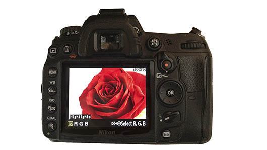
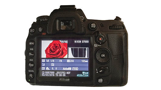
My Nikon Camera LCD
 |
With RAW, it's good to know that your image preview shows a JPG image. You can recover a certain amount of "blown out" detail in highlights and dark tones in Lightroom or Photoshop... not so if you shoot JPG. |
 |
Once you turn on your histogram option in your camera, you might find that you've got another choice besides luminance (tonal brightness)... you might also have an option for RGB (the red, green and blue tones in your image). |
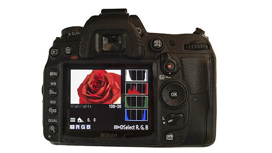 |
An RGB view might come in handy in some situations, like for the reds in skin tones in portrait photos. But, I use the luminance view almost exclusively. |
Tonal Curves in Photoshop
This page isn't about photo editing but I want to let you know that there is another type of tonal curve you have access to.
A quick look at Photoshop.... with an added tonal map, you'll get information that may come in handy for editing. For instance,
- when you have too much of one or more specific colors in your photo and you want to adjust them individually....
- or for creating special effects, like posterizing
The colored tonal map in Photoshop shows red, yellow, green, cyan, blue and magenta.
If you get very serious about Photoshop, you'll eventually want to learn much more about luminosity and color graphs.
But the luminance map is the most accurate for showing the brightness levels in your image and that's usually the one you'll use in your camera.
If you're wondering why the curves all look so different, you'll find a more advanced discussion of luminosity and color here.


Wrapping It Up
What do you think? Is there such a thing as a bad histogram?
Not really... though you heard me joke that there is! It's simply a story about all the tones in an image... it tells it like it is.

Histograms can be any shape and still be absolutely perfect exposure... for one particular photo. The only 'bad' histogram shows a photo that isn't exposed the way you planned. And that's not really bad, it's just information that can lead you to what you want.
Every shot is a process and every "failure" gives you more information and gets you that much closer to a successful photograph!
Now go experiment!
Please leave a comment below on what you've learned or any topic you want to know about. And if you enjoyed this page, it would be super if you'd "like" it.
All this helps me know how to create even more great content for you.
About the video on this page, the histograms are not 'in-camera'. I used Photoshop, rather than in-camera histograms for teaching purposes. The images of my live camera view are from my Nikon D7000.
Stock Photography: I used stock photos for the histograms. Thank you to picjumbo.com, unsplash.com, dreamypixel.com, isorepublic.com, and kaboompics.com who will generously share their amazing stock photos.
Pictures of old cameras are from Wikipedia:
Leica film camera 1925: By Rama - Own work, CC BY-SA 2.0 fr, https://commons.wikimedia.org/w/index.php?curid=406264
Wiki old digital Minolta 1995: By Jamo spingal - Own work, CC BY-SA 3.0, https://commons.wikimedia.org/w/index.php?curid=29509267
Old Nikon 1999: By WikiCapa at English Wikipedia - Transferred from en.wikipedia to Commons., Public Domain, https://commons.wikimedia.org/w/index.php?curid=1917871

Flower Photography Home › Learn Basic Photography › The Histogram
SUBSCRIBE & STAY IN TOUCH
Recent Articles
-
These Heron Images Make Stunning Fine Art Prints Or Note Cards
Jan 29, 19 06:49 PM
 I love my heron images from here on Vancouver Island. One particular pair of herons are always obliging models. They're relaxed and trusting while I photograph and talk to them.
 -
Your Histogram Makes Correct Exposure a Breeze
Jan 22, 19 05:23 PM
 A histogram is easy to read with a bit of practice. An effective tool to help you get the picture you imagine.
 -
Yeomiji Outdoor Gardens, Asia To Europe Without The Jet Lag
Jan 22, 19 04:33 PM
 Yeomiji outdoor gardens delivers a French, Italian and Japanese garden along with several culturally significant Korean gardens.
New! Comments
Please leave me a comment in the box below.I'd love to hear your stories, share your photos and read your comments about this page.